
Project Management · 2024
Vantage PS
A logo and visual identity project for Vantage Project Solutions, a specialist construction planning consultancy. The brief focused on expressing clarity, precision and foresight, helping the business present itself with the confidence and credibility its expertise deserved.
Visit live website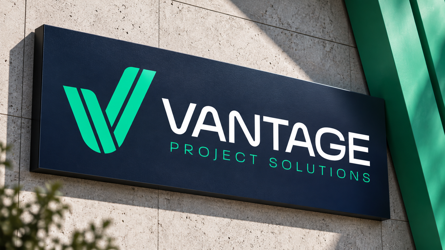
A logo and visual identity project for Vantage Project Solutions, a specialist construction planning consultancy. The brief focused on expressing clarity, precision and foresight, helping the business present itself with the confidence and credibility its expertise deserved.
Vantage needed to establish trust with developers, project managers and construction contractors. Its identity had to communicate the authority of an experienced consultancy while making its strategic value clear: helping clients understand complex projects, anticipate challenges and make informed decisions.
Creative direction
The starting point was the meaning of “Vantage”: a clearer view, the ability to see further and a position of advantage. These ideas informed a direction centred on foresight, accuracy and confidence. The client’s preference for blue and purple offered a starting point for balancing a calm, reassuring presence with a distinctive character.
The identity system
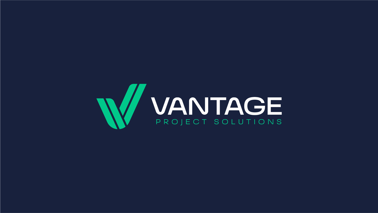
The brief called for a clear, recognisable logo that could anchor Vantage’s visual identity. The priorities were simplicity, a modern character and a strong relationship between the Vantage name and the Project Solutions descriptor, helping audiences recognise the business and understand its focus.
The outcome
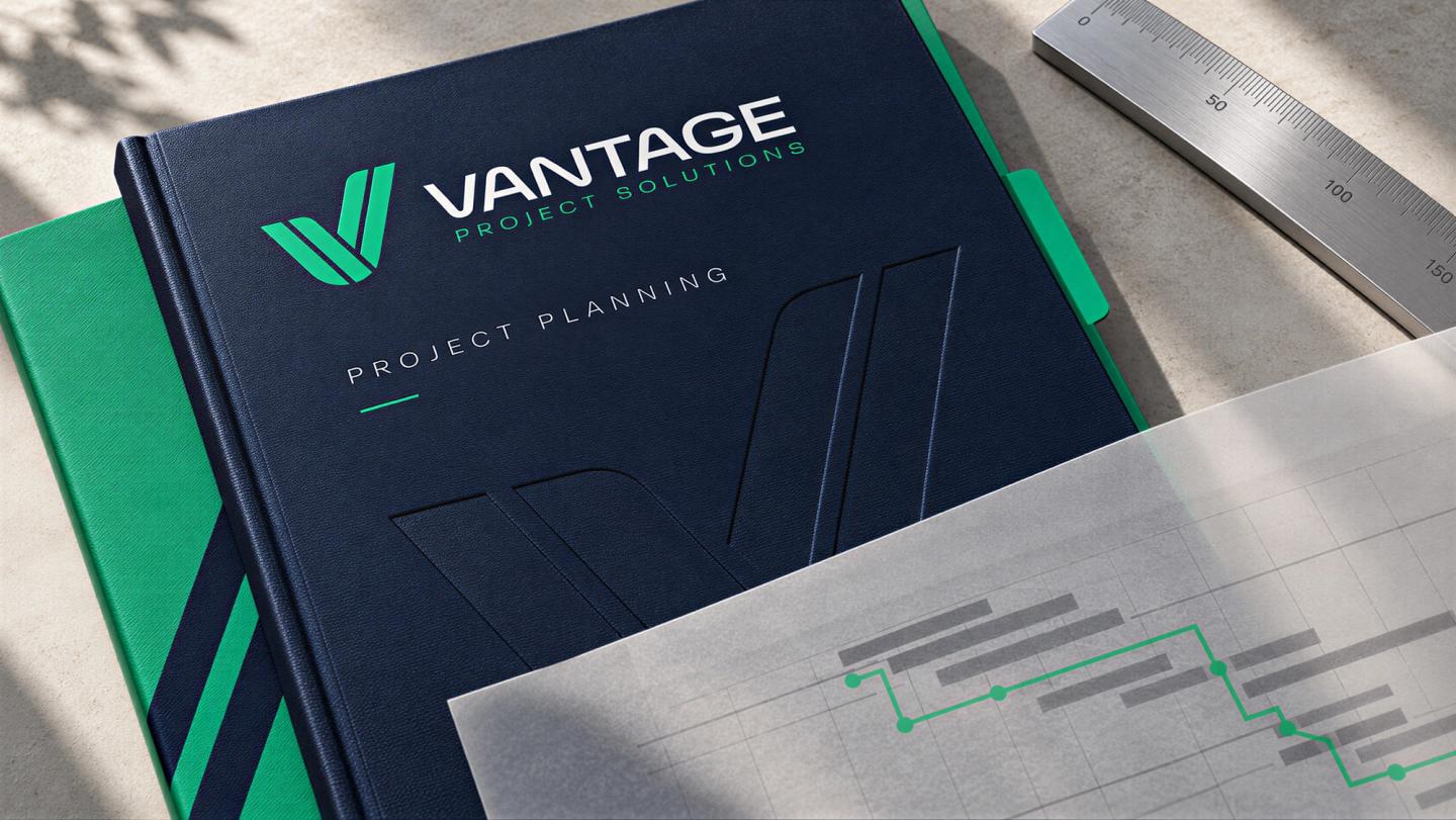
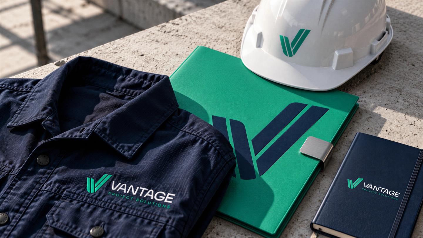
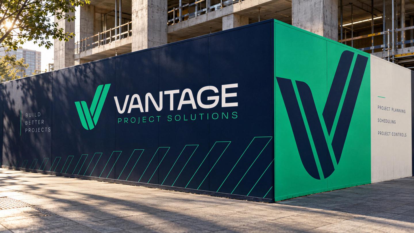
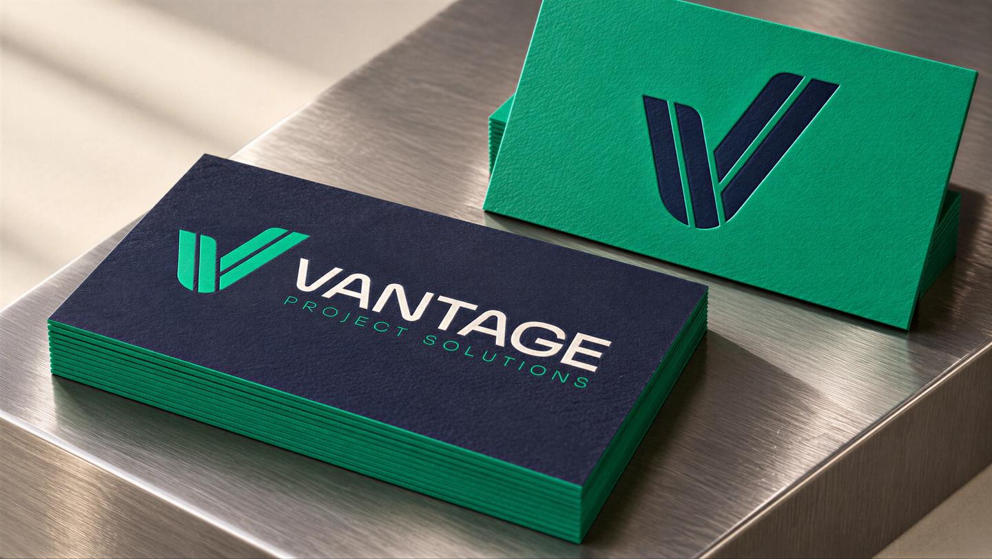
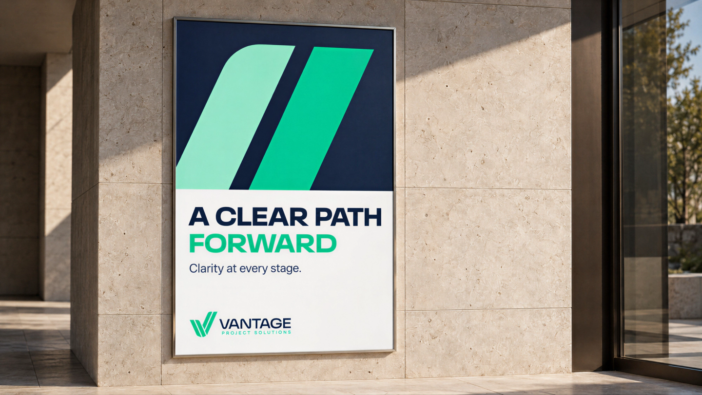
Vantage’s expertise now has a visual presence to match. The symbol combines a V with a check mark, connecting the company’s name with confidence, accuracy and successful completion. Paired with precise lettering and vibrant green against deep navy, it gives the consultancy a distinctive, professional presence—expressing the reassurance clients seek when placing a complex project in expert hands.
““The identity captures exactly what I wanted Vantage to communicate: clarity, confidence and precision. It gives the business a professional presence that reflects the expertise behind it.” — Alex King, Vantage Project Solutions”
Need a transformation like this?